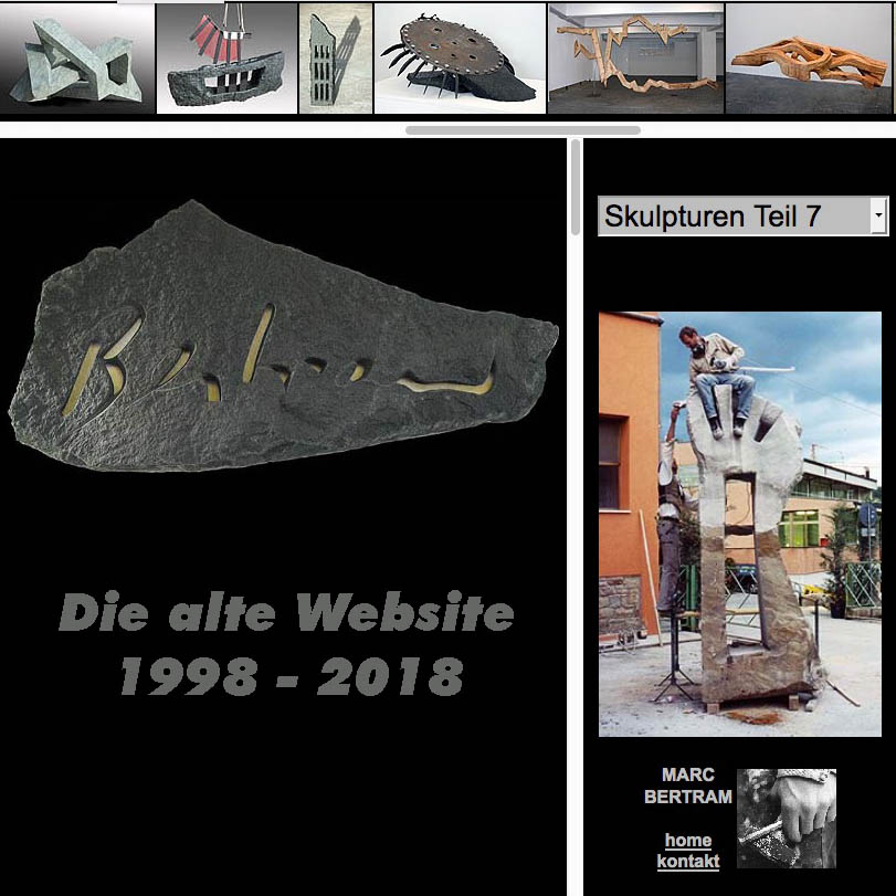
Es ist ein bisschen Nostalgie aber auch ein Teil von mir, denn die Website von 1998 habe ich mit etwas Starthilfe von Bernward Frank, einem Kinetic Künstler, über die Jahre selbst aufgebaut. Damals waren Frames, das sind die festen Bereiche, die die Seite unterteilen ein Novum und überaus praktisch. Die Frames sparen jede Menge Datenfluss, denn es wird nicht immer die komplette Seite neu geladen, sondern nur die Bilder, die man sich in groß anschauen möchte.
Ursprünglich öffnete sich die Website über eine Weiterleitung in einem neuen Fenster ohne Browsermenü, um die damals kleine Bildschirmfläche wie in einem Vollbildmodus zu sehen. Da diese elegante Möglichkeit oft von Firmen für nervige Werbung genutzt wurde und sich Popup-Blocker allgemein durchgesetzt hatten, habe ich diese Weiterleitung schon nach kurzer Zeit wieder abgeschaltet.
Ein Zurückbutton war überflüssig, denn man konnte ohne zurück zu gehen jederzeit an jede Stelle der Website kommen. Die Ladezeiten wurden so minimiert.
Optimiert war die Seite anfangs für 15″ – 17″ Monitore mit einer festen Miniatur Bildleiste im Top und einem festen rechten Frame, der wiederum in drei Bereiche unterteilt ist.
Das Hauptfenster hat sich dem Bildschirm und Fensterformat angepasst. Die Fotos der Skulpturen waren je nach Format – hoch oder quer- relativ ausgerichtet und skalierten sich ständig optimal in das Fenster.
Mit dem Aufkommen der Monitore im 16:9 und 16:10 passte oft die Skalierung nicht mehr optimal, denn ein Bild, dass vorher im 2:3 Querformat in optimaler Breite mit 100% angelegt war, wurde nun unten abgeschnitten. Um die Arbeit komplett sehen zu können, musste man nun den Frame srcollen.
Mit dem Aufkommen der Smartphones und Tablets tauchte plötzlich das Problem auf, dass die Fotos nicht mehr vollformatig im Frame angezeigt wurden, sondern teilweise nur als nicht erkennbare Miniaturbildchen und teilweise als Ausschnitt. Die relative Ausrichtung habe ich daher entfernen müssen.
Nun hat sich aber die Nutzung des mobilen Internets so sehr durchgesetzt, dann ich mich der neuen Technik nicht versperren konnte.
Trotzdem trauere ich der alten Seite noch hinterher, denn ich konnte alles selber verändern und brauchte dazu nur einen simplen Texteditor. Die Seite hatte bewusst kein Design, denn ich wollte den Bildschirm optimal ausnutzen. Der Betrachter sollte nur von meinen Arbeiten beeindruckt werden und nicht von graphischen Spielereien.
Die neue Seite ist also nur aus der Notwendigkeit heraus entstanden, um von allen Geräten problemlos betrachtet werden zu können. Sie ist ein Kompromiss, der leider wie vieles in der heutigen Zeit als Fortschritt angesehen wird, letztlich aber hauptsächlich viel Arbeit und Zeit gekostet hat. Ich bin nun abhängig von einem Programmierer, von WordPress und kann nur noch Inhalte in ein Korsett stellen.
Der maximale Bildausschnitt ist begrenzt und ohne Zurückfunktion geht es auch nicht mehr.
Wenn Sie nun einen Blick auf die alte Seite werfen wollen, um Arbeiten zu suchen, die ich nicht in die neue Seite übernommen habe, dann empfehle ich ihnen dies mit einem Laptop oder Desktop Rechner zu tun.
It’s a bit of nostalgia but also a part of me, because I built up the website from 1998 over the years myself with a bit of help from Bernward Frank, a Kinetic artist. Frames were then, these are the fixed areas that divide the page a novelty and extremely practical. The frames save a lot of data flow, because it is not always the entire page reloaded, but only the images that you want to look at in large.
Originally, the site opened via a redirect in a new window without a browser menu to see the then small screen area as in a full-screen mode. Since this elegant option was often used by companies for annoying advertising and Popup blockers had generally prevailed, I have switched off this forwarding after a short time again.
A back button was superfluous, because you could come back to any part of the website at any time without having to go back. The loading times were minimized.
The page was initially optimized for 15 „- 17“ monitors with a fixed miniature image bar in the top and a fixed right frame, which in turn is divided into three areas.
The main window has adapted to the screen and window format. Depending on the format, the photos of the sculptures were oriented vertically or horizontally and were always optimally scaled into the window.
With the emergence of the monitors in 16: 9 and 16:10 often did not fit the scale optimal, because an image that was previously created in 2: 3 landscape format in optimal width with 100%, has now been cut off below. To see the work completely, you had to scroll the frame.
With the advent of smartphones and tablets suddenly appeared the problem that the photos were no longer fully displayed in the frame, but sometimes only as unrecognizable thumbnail and partially as a section. I therefore had to remove the relative orientation.
Now, however, the use of the mobile Internet has prevailed so much, then I could not block the new technology.
Nevertheless, I still mourn the old side, because I could change everything myself and needed only a simple text editor. The site had deliberately no design, because I wanted to make the most of the screen. The viewer should be impressed only by my work and not by graphic gimmicks.
So the new site was created out of necessity to be easily viewed by all devices. It is a compromise that, unfortunately, like much of today, is considered progress, but has ultimately cost a lot of work and time. I’m now dependent on a programmer, WordPress and can only put content in a corset.
The maximum picture detail is limited and it does not work without a back function.
If you now want to take a look at the old page to look for work that I have not taken over in the new page, then I recommend them doing this with a laptop or desktop computer.